Evaluating Libby
Note: For assessment, you don't need to UAR everything. Just do one UAR for alt text images, and give an idea of how pervasive the problem is.
Sign up process
The landing page and signup process on the website is minimal, but its simplicity is a strength. While WAVE does report a lack of headings, I don't think this will actually impact usability very much. There's very easily keyboard-navigable buttons to go back and forth, and a straightforward interface to add your library card, or search for a library near you, to get started. Another nice feature of Libby is that you can set up your account on any of your devices (web, iOS, Android), and then simply copy over a unique setup code from one device to another to access your account from another device. This is a great fallback in case an accessibility bug interferes with operating one of the apps. Because sign up seems to be quite accessible, I'll evaluate the task of browsing and selecting content.
Strengths
Good aria-labels on filters for navigation.
Good kb navigation (first thing to tab into is a nav menu)
UARs
Overall, I thought the signup process was a simple and straightforward experience. One useful feature is that if you have already signed up and added library cards on one device (web, Android, or iOS), you can generate an 8-digit sign in code on that device log in to a new one. This is not only convenient, but offers a good fallback mechanism if a bug arises in one of the applications' sign up processes.
However, there's a few problems I found with using this method.
- Time limited to 60s.
- Custom kb input
WAVE reports the error that the input has a missing form label, but I think the problem is a more general one:
AT-1
- Name: Unconventional text input
- Aspect: Problem
- Evidence: As seen the in the screenshot of HTML, this is not a standard text input, but rather single-digit divs.
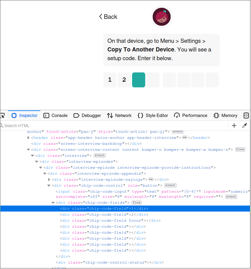
- Explanation: Websites should use conventional markup so that screen readers can interpret the content in a standard way. This HTML markup is favoring a stylish modern widget over accessibility standards, and violates the spirit of robust compatibility. The specific guideline violated is WCAG 4.1.2 Name, Role, Value
- Severity: 2
- Justification:
- Frequency: This occurs just once, if the user tries to bootstrap a second device from their first.
- Impact: I think the impact is low. Under the hood, there is a single text input that responds to standard keyboard input. However the individual text entries are not aria-hidden, so screen reader users will see changing content as they enter text into the input, which may cause confusion.
- Persistence: There is no way to avoid this problem.
- Possible Solution: Remove the individual text entry
divelements, and just have a normal, visible text input. - Relationship to other problems: The underlying form input is the one mentioned in "AT-2: Missing form label".
AT-2
- Name: Missing form label
- Aspect: Problem
- Evidence: There is no label attribute on the form input below.
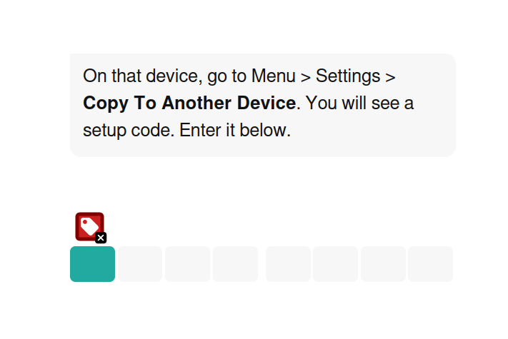
- Explanation: The form input is missing a label, so screen users that navigate to the input won't have immediate context for the purpose of the input, which violates WCAG 1.3.1 Info and Relationships and
WCAG 1.1.1 Non-text Content(1.1.1 is relevant but choosing to categorize under another). - Severity: 1
- Justification:
- Frequency: This occurs just once, if the user tries to bootstrap a second device from their first.
- Impact: The impact is quite low. The entire screen is quite simple (the entirety of the screenshot above) so the user should have ample context to know what the form input is for.
- Persistence: There is no way to avoid this problem
- Possible Solution: Add a label "Device setup code" to the form input.
- Relationship to other problems: This is the hidden form input mentioned in AT-1: Unconventional text input.
AT-3
- Name: Missing first level heading
- Aspect: Problem
- Evidence: Each of the top level pages are missing a top-level heading, as pictured in the screenshot below.

- Explanation: This is a problem for all users, but particularly screen readers that rely on structural headings for context. The user should have clear
<h1>headings describing what page they are on. This is in violation of guidelines WCAG 1.3.1 Info and Relationships andWCAG 2.4.6 Headings and Labels(choosing former). - Severity: 3
- Justification:
- Frequency: This problem is common across the entire application.
- Impact: The impact isn't too great, and it is alleviated by the fact that the pages of the application are very small-scoped in nature. Still, the lack of context can cause some confusion for screen readers.
- Persistence: There is no way to avoid this problem.
- Possible Solution: Add an
<h1>level header on each page with a descriptive title text. - Relationship to other problems: None.
AT-4
- Name: Low contrast text
- Aspect: Problem
- Evidence: Some of the pages have a styled header section with low contrast (3.06:1) text, as seen in the screenshot.
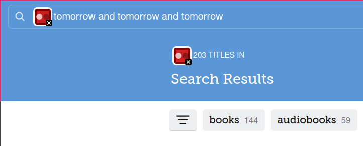
- Explanation: The low contrast text makes the content more difficult for low-vision users to see and violates WCAG 1.4.3 Contrast Minimum.
- Severity: 1
- Justification:
- Frequency: This problem only occurs on some of the search results pages.
- Impact: This impacts low vision users. The contrast level of 3.06:1 is in violation, but not by too much.
- Persistence: The only way to avoid this problem is to use an external tool to adjust colors on screen, or to not use the search feature.
- Possible Solution: Adjust either the foreground or background color to increase contrast to at least 4.5:1.
- Relationship to other problems: None.
SR-1
- Name: Awkward screen reader navigation
- Aspect: Problem
- Evidence: When moving focus through the Menu screen on Android with a screen reader, there are multiple text spans within a single paragraph that must be traversed.
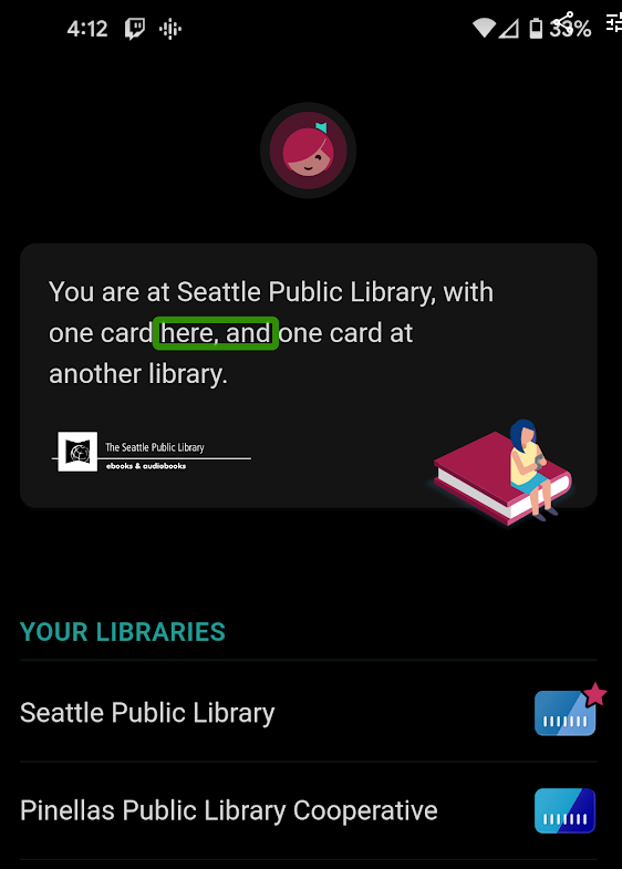
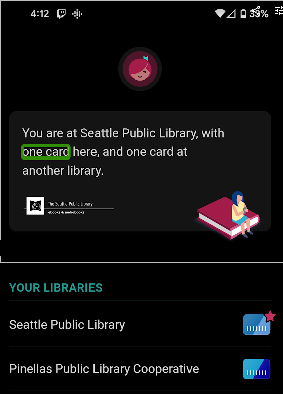
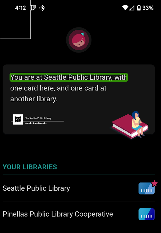
- Explanation: This is a bad situation for screen readers that need to tediously traverse what should be a logical text segment. On the website, one can inspect the HTML and see that there are multiple spans breaking up this paragraph. The markup should instead treat this as a single logical unit of text. Categorization is up to interpretation, but this could reasonably be considered a violation of WCAG 2.4.3 Focus Order or WCAG 4.1.3 Status Messages, since this text is presenting the state of the application to the user.
- Severity: 1
- Justification:
- Frequency: I see this only occurring in one place.
- Impact: Tabbing with a keyboard simply passes over the paragraph, but it does impact screen readers that need to read or skip over the status.
- Persistence: There's no way to avoid this problem on a screen reader.
- Possible Solution: I would suppose that simply avoiding the separate span tags would fix this, but there may be an ARIA method for treating the parent div as a single container as well. In the context of 4.1.3, one could use the
role=statuson this element, but this might only make sense if the element is not static as it is now. - Relationship to other problems: None.